Thursday, April 27, 2006

The Editor's Tick

Bet all you scribes out there didn't know (or care?) that copy editors have different, specialized areas of editing neurosis. Every copy editor is driven to special distraction by a certain type of error; sometimes editors can become so fixated on that error that they gloss over other things that need fixing in copy.

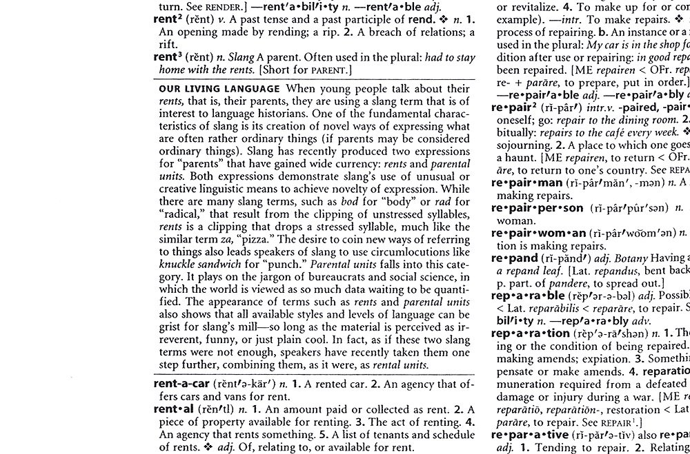
Personally, I fixate on the "one-word, two-word or hyphenated" question. I bet I open the dictionary 50 times in a shift to look up terms like "lockjaw," "cell phone" and "jump-start."

What about you, oh geeks of mine? What copy error is your (dis)pleasure?

Monday, April 24, 2006

"Women" Confuse Me

No, not like that. Well, yes like that, but we're not concerned with that on this blog.

I'm more confused by the word "women" when used as a modifier of a plural noun. For example, everyone always wants to call them "women executives." That sounds correct, right? But why put the modifier in the plural? You wouldn't call them "females executives." So I'm always changing this to "woman executives," which everyone in the world probably thinks is wrong, but I think is right.

So, ladies and gentlemen, lemme have it. Am I right? Or have I screwed it up once again when it comes to "women"?

Thursday, April 20, 2006

Nervous Laughter

Wednesday, April 19, 2006

Credit Where Credit Is Due

We copy editors often complain about the state of grammar and punctuation used in the world outside publishing. If you ever have a dinner date with a copy editor (I hear the laughter over at the real Style Council already), plan on a minimum of five minutes in which your copy editor dinner date (seriously, girls, stop laughing) will bemoan the low literary state of the establishment's menu. The same goes for billboards, marketing circulars and graffiti.

But sometimes the world gets it right, such as on my coffee mug, found below. That second line is a comma minefield, but the writer and editor took the task head-on, robustly and courageously employing commas after "Pimp" and "Tom."

Coffee mug, I salute you.


Tuesday, April 18, 2006

TOSC Tip

Webster's New World College Dictionary is the best dicionary to drum on while driving and listening to Medeski Martin and Wood. (Why I drive around town with my dictionary is my own damn business. Y'hear?)

Look to this space in coming days for more aural fun with dictionaries.

Saturday, April 15, 2006

website vs. Web site

I vote for "website."

L.A. Weekly's style has been "Web site" since circa 1999, when the World Wide Web was just emerging into popular consciousness as a newfangled creation for instant messaging, online shopping, and downloading pics of cute sexy naked Asian girls. (And thankfully it still is.) But nobody in today's modern universe thinks of the World Wide Web as some godly entity that deserves all caps. I mean, it's not the Bible, fer Chrissake.

And the Lord sayeth, "website" shall be one word, lowercased.

James, by Craig

Friday, April 14, 2006

I Like 21

Thursday, April 13, 2006

Fun With Geography!

Here's a little issue we deal with every now and again:

What regions of the country would say these states are in:

  • Missouri (South? Midwest? Plains?)
  • Pennsylvania (Midwest? Northeast?)
  • Michigan (Midwest? Upper Midwest? Canada?)

Wednesday, April 12, 2006

Notes from Tuesday

  • Don't you hate it when you're doing a find-and-replace for double spaces, but then it misses a few? I mean, c'mon find-and-replace function!
  • Isn't it odd how the L.A. Weekly spell-check doesn't think "L.A." is spelled correctly? Let's get with the program, spell-checker!
  • I've always found it much more satisfying to staple together a set of proofs rather than use a paper clip. That distinctive stapler click gives one a feeling of tidiness, decisiveness, finality. With a paper clip, you can always easily pull apart the pages. But you've got to be damn sure you're done with the proof when you use the stapler. There's no turning back after using the stapler!

The Other Style Council


Craig: "I'll get right on that TPS report."


Derek: "Yes, I get paid to use a stapler."


James: "I can't get no punctuation."

Monday, April 10, 2006

A More Proper Introduction

Welcome to The Other Style Council, or TOSC for short (please note that the acronym is uppercase and without periods; L.A. Weekly style calls for periods only when the acronym contains two letters). You all know about the first Style Council. Those are the hot, stylish chicks who can get into any party they want. They write for the Weekly's (please note that the apostrophe and "s" are romanized) La Vida section and their own red-hot blog, sending in dispatches from far and wide about fashion, nightlife and the wild times Los Angeles has to offer.

But lurking on the mezzanine level of the Weekly's offices is another Style Council, one whose glasses are much less stylish (but thicker and always on, what with all the reading we do), one whose members consider it "dressed up" to have one's shirt tucked in. When they say "Style," they mean Trina Turk (whoever the hell that is); when we say "Style," we mean Associated Press. See that first post about what we do for boxes containing information on live music shows around L.A.? While we're worrying if the text is in the proper font, the original Style Council is worrying about what to wear to the show.

So why does this blog exist? Because Derek spent a few hours Friday night creating that crackerjack illustration at the top of the page (please note that Derek spent Friday night creating a graphic whose sole purpose is to out himself and two colleagues as geeks). So now we're stuck with it. Look to this space in the future for discussions about the auditory differences in slamming shut American Heritage and Webster's New World College dictionaries, what we eat for dinner Tuesday nights, the existential implications in romanizing URLs in copy, how much I hate en dashes (oh, how I hate you, en dashes!) and the singular genius of Ray Bradbury.

Rent

Friday, April 07, 2006

Style Change

The Capper writes:

I should have announced this stylistic change in a more formal fashion: In the Music section, Kate has changed the format of the album and live-show information. Instead of doing it at the end like we used to do (and still do in all the other sections), we now put it in a little gray box somewhere in the middle of the copy. She generally puts it at the top of the file with a note to art department tagged "info box." We don't have a style sheet for it -- it's probably fine to leave it as File Info, as long as it's clearly tagged for the art department and it's up at the top of the file. If I remember to do it, though, I just style it manually as Triplex Serif bold 9.5/11 ... And it gets bullets (option/8 is the keystroke) instead of the vertical lines in between. A recent example can be found in issue 15, page 100. The wording of the live-show info tends to vary a little bit -- I'm still trying to zero in on a permanent formula, which I'll let everyone know about if I do. The one on page 100 there is a good guide to follow.